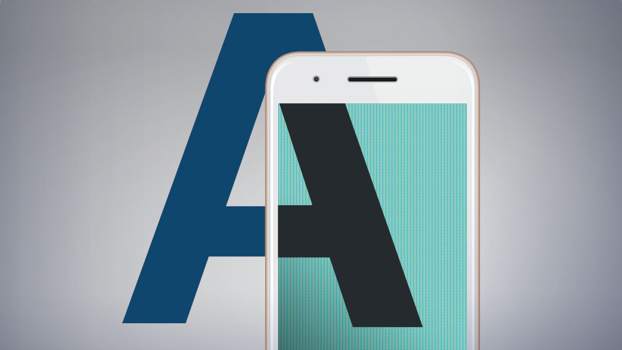
What’s typography got to do with the multi-screen mobile age we live in? A quick story from the past will help make it clear.
Back in 1938, 60 years before Google, everyone used telephone directories. To keep the system thriving, that meant making the directories as user-friendly as possible, while controlling production costs. That, in turn, meant using inexpensive newsprint paper and smaller type to keep the amount of pages in check. But, there was one problem. The printing presses at the time were notorious for “clogging the counters.” Counters are those negative, white spaces inside of letters, like in “e” and “o.” When the type got too small, everything just looked globby.
Enter Chauncey H. Griffith, a type guru heading up Mergenthaler Linotype Co.’s typographic development back in the 1930s. He was asked to develop a typeface that would guarantee maximum legibility when printed small on cheap paper. In other words, give us our cake, and yes, we want to eat it too! So, Griffith gave the world, Bell Gothic. It became the proprietary type for all phone books for many, many years.
And what was important back in 1938 still holds true today, especially for mobile: maximize legibility. It sounds so simple, yet day in and day out, I see people over-complicating it. Just think, after all of the marketing strategizing, refining the message, and fine tuning the visuals, nobody can understand your content because we got too fancy with the type. But, if we create something that belongs more on the wall of an optometrist, or we forgot to treat the mobile screen like a mini-billboard, then we’re doomed to fail. Too much copy, thin fonts with decorative serifs, or just not enough contrast to make your line more legible. Chauncey H. Griffith would not be happy.
So here are some quick points to consider when you’re producing mobile content with type:
- Sans serif type is best—consistent stroke and very legible at small sizes.
- Not dissing serif—it’s fine if it is used at a reasonable size or as the main visual.
- Contrast is king—Subtlety can ruin legibility.
- Integration—when you can make type be part of the visual, it’s eye-catching and memorable.
- No type!—you know, you could just go with a picture.
- My favorite: Don’t be afraid to break the rules.


